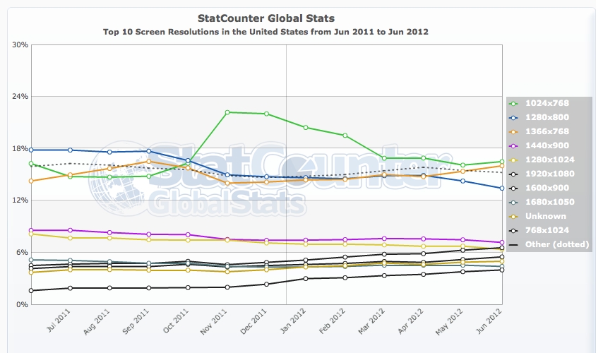
Note: StatCounter is not fully representative because not all websites use StatCounter.
Wondering whether you need to make your web designs work well on low-display resolutions? Well, in the United States, from June 2011 through to June 2012, 1024×768 remains the most used display resolution for websites using StatCounter.
- 1024 x 768: 16.49%
- 1366 x 768: 16%
- 1280 x 800: 13.41%
- 1440 x 900: 7.15%
- 1920 x 1080: 6.55%
Worldwide isn’t much different either, with 1024 x 768 display resolution being the second most popular display resolution at 17.38%. Tips to make your designs work well on lower display resolutions.
Try to avoid using too many floats.
Floating too many HTML elements can be a factor in your design looking inconsistent on lower display resolutions. If you need to use floats, have an upper div within the body section of your HTML document and set it as position: absolute so any div within it will float within the constraints of the upper div.
Use percentage-based widths.
When setting the size of divs, use percentage-based widths where appropriate. This means regardless of the display resolution, the actual width of the HTML element will look similarly positioned whether it’s 1024×768 or 1920×1080.
Do not position elements unless necessary.
If you absolutely position elements, it can create issues for users on lower display resolutions, as regardless of the display resolution the div that is positioned will remain there, perhaps overlapping other elements on lower display resolutions.
Have a mobile theme.
If you have WordPress you can install a free plugin called “WP Mobile Detector” that will automatically activate a mobile theme if it is detected that a visitor is using a smartphone or mobile phone. Simply install the plugin and once activated, it’ll change to a mobile user interface for visitors accessing your blog on their smartphone or mobile phone. For mobile phones, it will activate a basic theme with no images.
